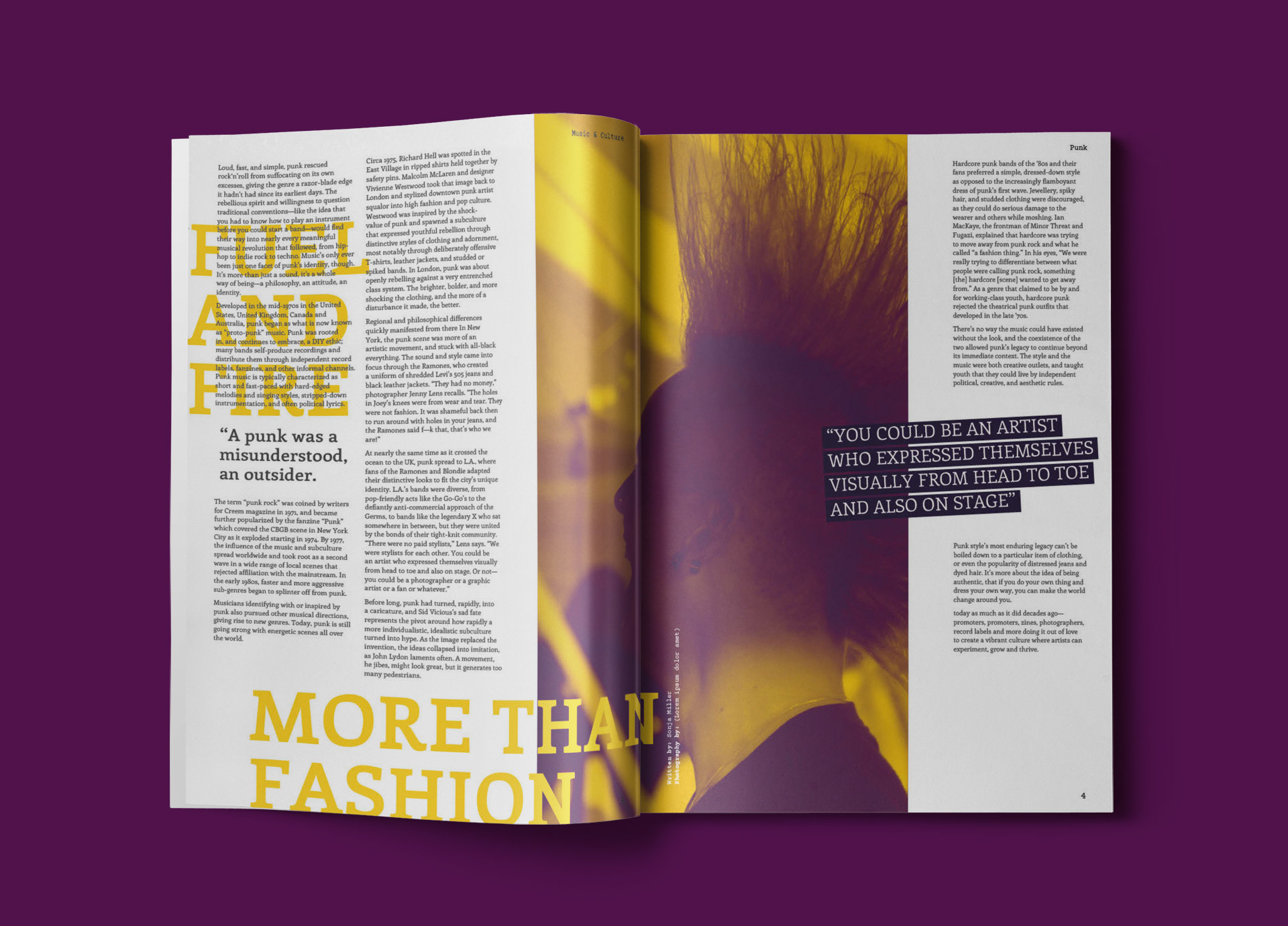
BRIEF
A new British music magazine aimed at a demographic who enjoy hearing about the rich stories from music history, the avid music reader who has a taste for something edgier and less consumerist.
BRAND VALUES
Vivid - Unpredictable - Non-conformist
Vivid - Unpredictable - Non-conformist
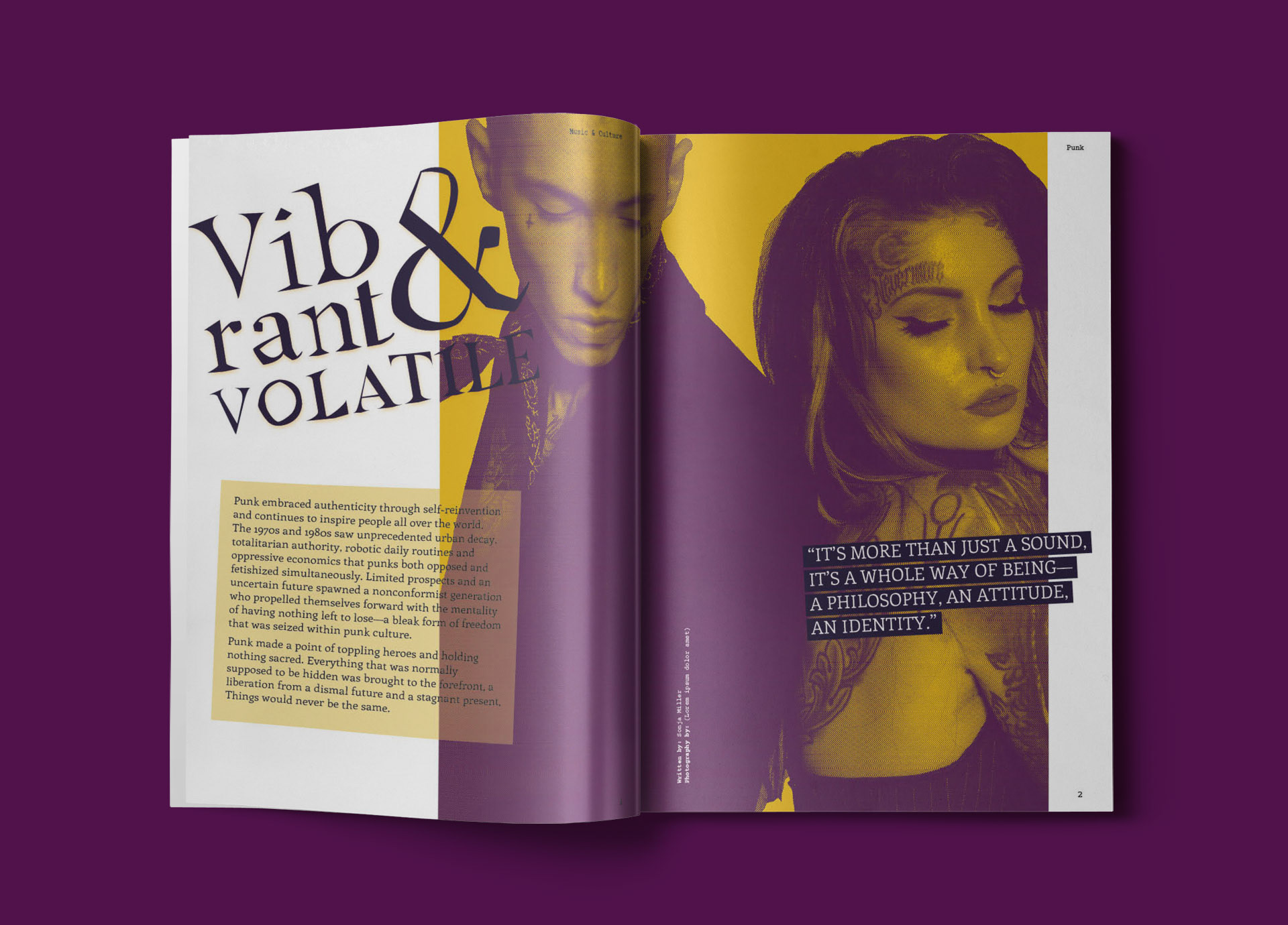
TYPE LOCKUP
The type lockup aims to depict the edgier side of punk music, getting away from typical clean typography. I customised the Butler font changing angles of the letters, so that it looked more unpredictable to reflect the sound of punk music.