PROJECT OVERVIEW
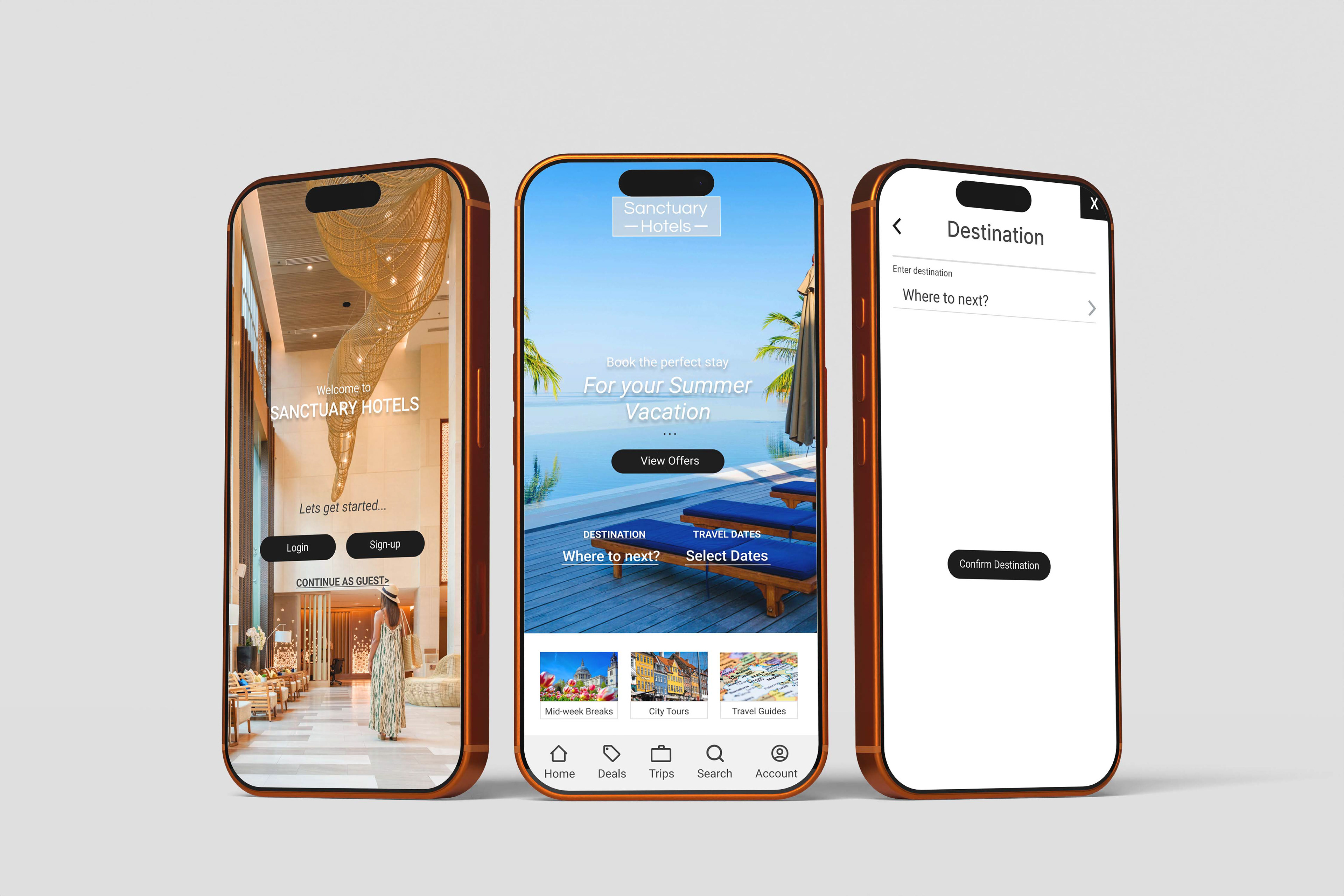
This project aimed to design an online hotel booking app for a fictitious hotel, named 'Sanctuary Hotel.' The company requested a user experience that is simple, accessible, and informed by a thorough understanding of their target users.
The end goal of the project was to create a clickable prototype and a set of detailed wireframes to hand over to UI designers and developers.
My Contribution:
I completed everything detailed in this project. I was responsible for all research and UX Design. In a real-world scenario, this project would then be handed over to UI designers and developers.
I completed everything detailed in this project. I was responsible for all research and UX Design. In a real-world scenario, this project would then be handed over to UI designers and developers.
UX RESEARCH
- Competitive Benchmarking
- Online Survey
- Usability Testing
OVERVIEW
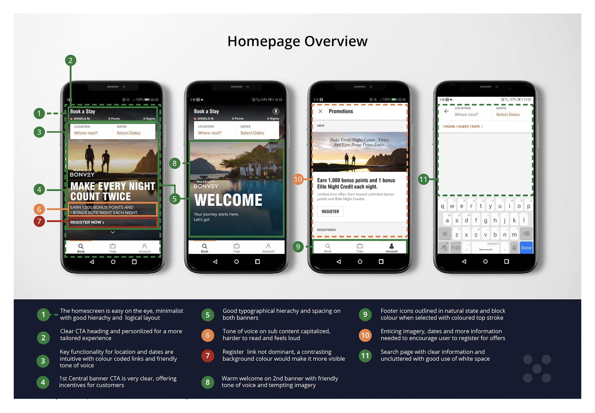
The project aims to review and analyse 4 hotel websites to research the usability on mobile apps within the hospitality industry. The hotels I reviewed were Marriot Bonvoy, Radisson Hotel Group, Design Hotels and Air BNB.
The objectives were to review the websites, emulate common conventions and best practices and develop an improved and more efficient product for users. The prime focus was based on the homepage, search and select functionality and user input details.
The objectives were to review the websites, emulate common conventions and best practices and develop an improved and more efficient product for users. The prime focus was based on the homepage, search and select functionality and user input details.
UX RESEARCH
- Competitive Benchmarking
- Online Survey
- Usability Testing
OVERVIEW
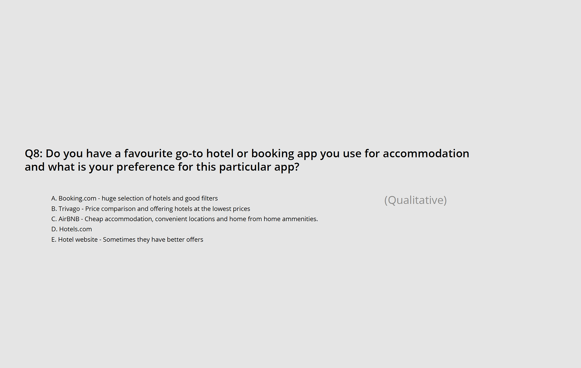
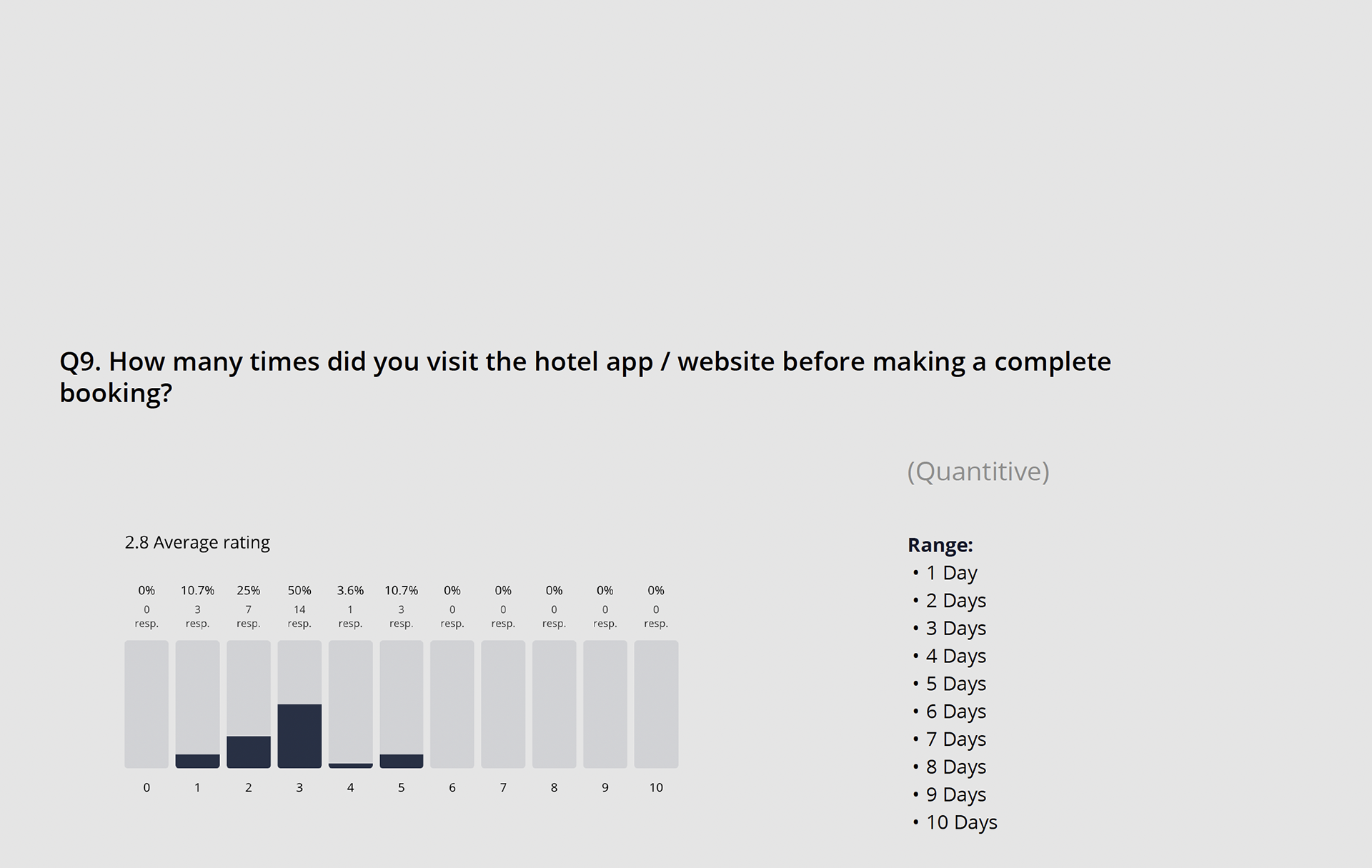
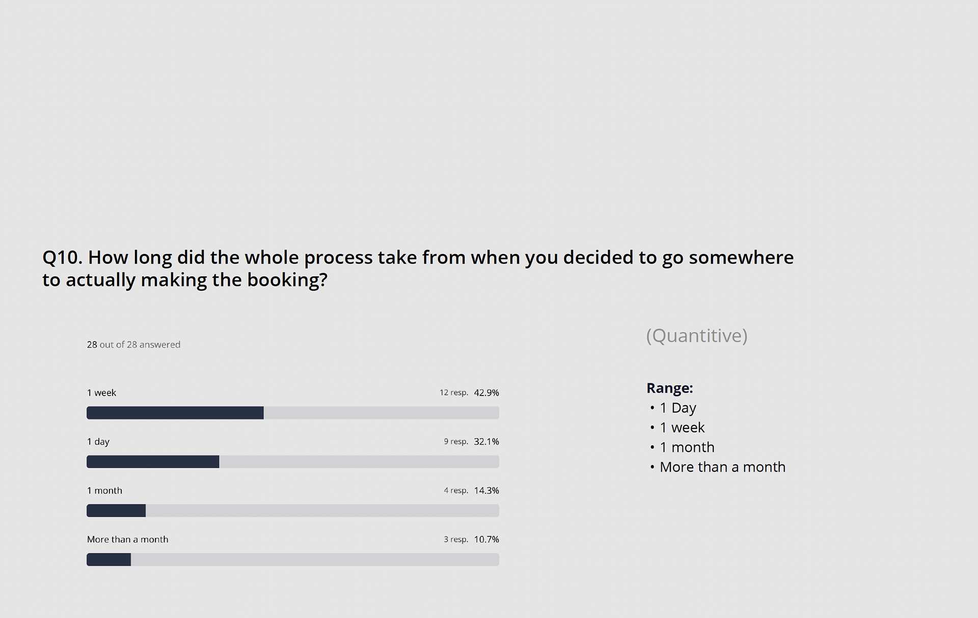
I then conducted an online survey to better understand users goals, behaviours and context. Gathering quantative and qualitative date allowed me to determine:
- More about the goals of travellers that use hotel/travel apps and websites
- Discover possible pain points
- Understand how a user navigates a website and what they're
trying to achieve
Findings concluded the most important factors included getting the best rates, reviews and photos
Navigating websites was frustrating and confusing along with ensuring online safety
UX RESEARCH
- Competitive Benchmarking
- Online Survey
- Usability Testing
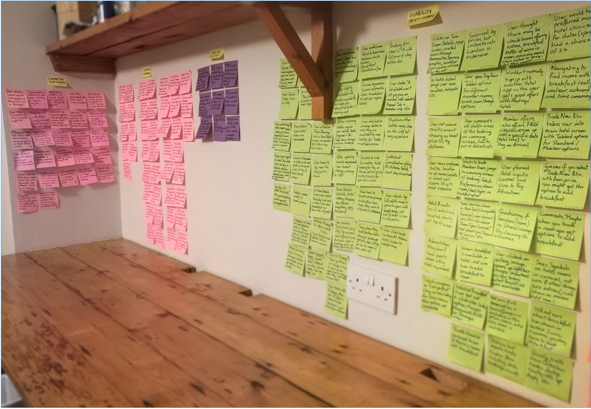
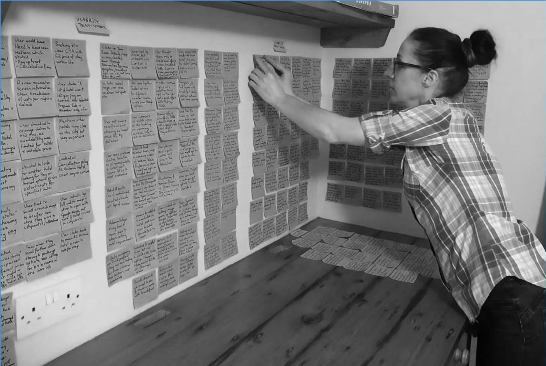
OVERVIEW
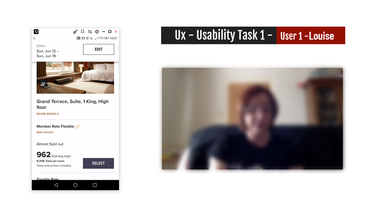
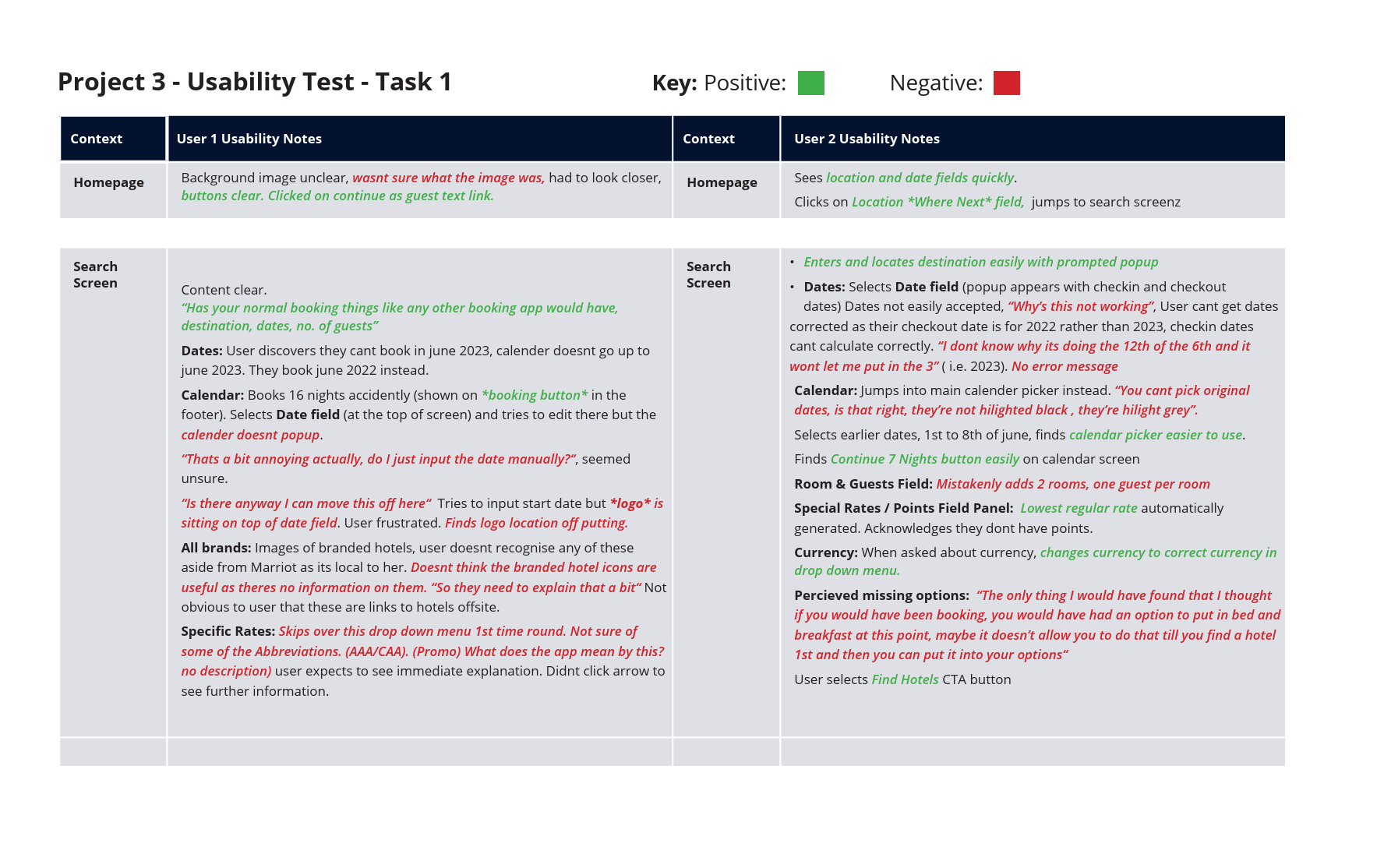
Part of the research process involved conducting a usability test and an in-depth interview with users to determine how they interacted with the website and record their mental models, behaviours, goals, and pain points.
I conducted usability tests across three different hotels, involving three users. Gaining a perspective on previous bookings, where they had preferences for particular hotels and their booking system.
Most issues discovered via the usability tests involved:
Most issues discovered via the usability tests involved:
- Problems inputting data
- Some of the information was inconsistent with their mental model, confusing, and outdated.
- Some of the information was inconsistent with their mental model, confusing, and outdated.
- User automatically given member prices, frustrating
- Currency incorrect on the UK site, frustrating for the user
- Icons and some information are not clearly described
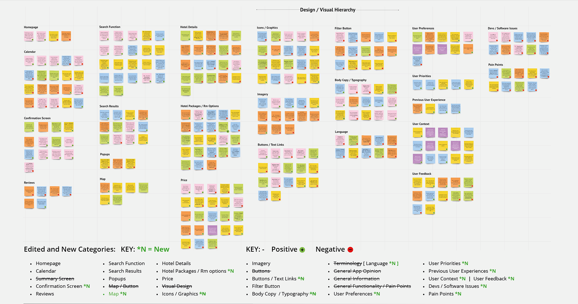
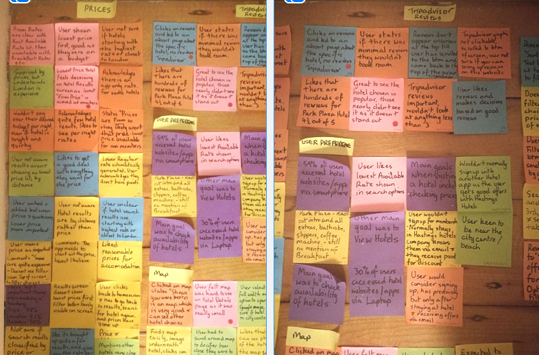
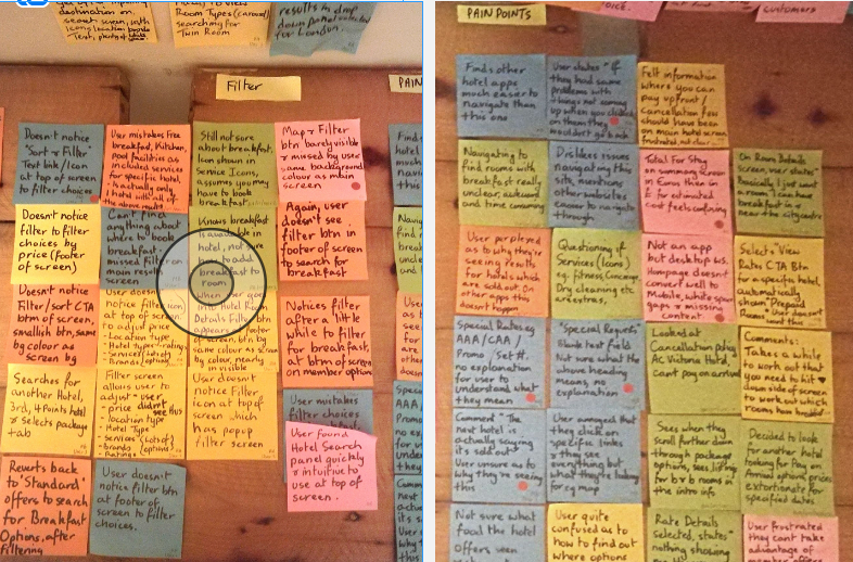
ANALYSIS - AFFINITY DIAGRAM
- AFFINITY DIAGRAM
- CUSTOMER JOURNEY
OVERVIEW
The next part of the process was to create an Affinity Diagram from all the research gained from the Competitive benchmark, Online Survey, Usability tests and notetaking.
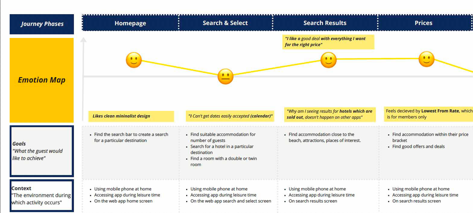
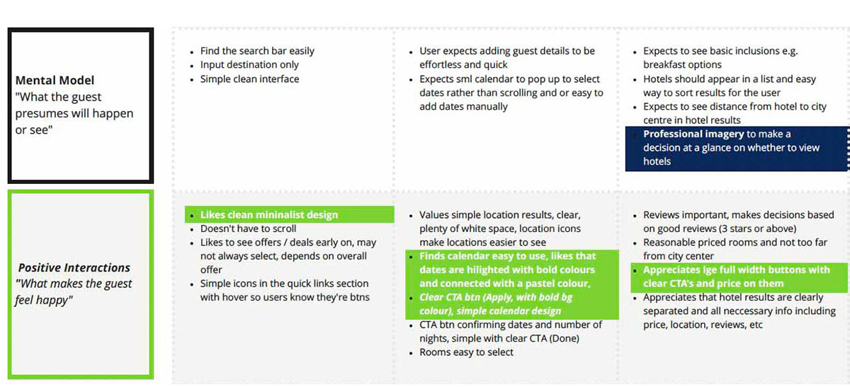
ANALYSIS - CUSTOMER JOURNEY
- AFFINITY DIAGRAM
- CUSTOMER JOURNEY
OVERVIEW
After organising all the post-it notes into groups, the information then had to be structured with more analysis into a customer journey map.
- Defining high-level steps in the journey.
- Document the goals of the user, positive interactions and any pain points.
- Defining high-level steps in the journey.
- Document the goals of the user, positive interactions and any pain points.
- Assess whether each step of the experience was positive or negative with added notes.
I was then able to see the customer's likes and dislikes.
I was then able to see the customer's likes and dislikes.
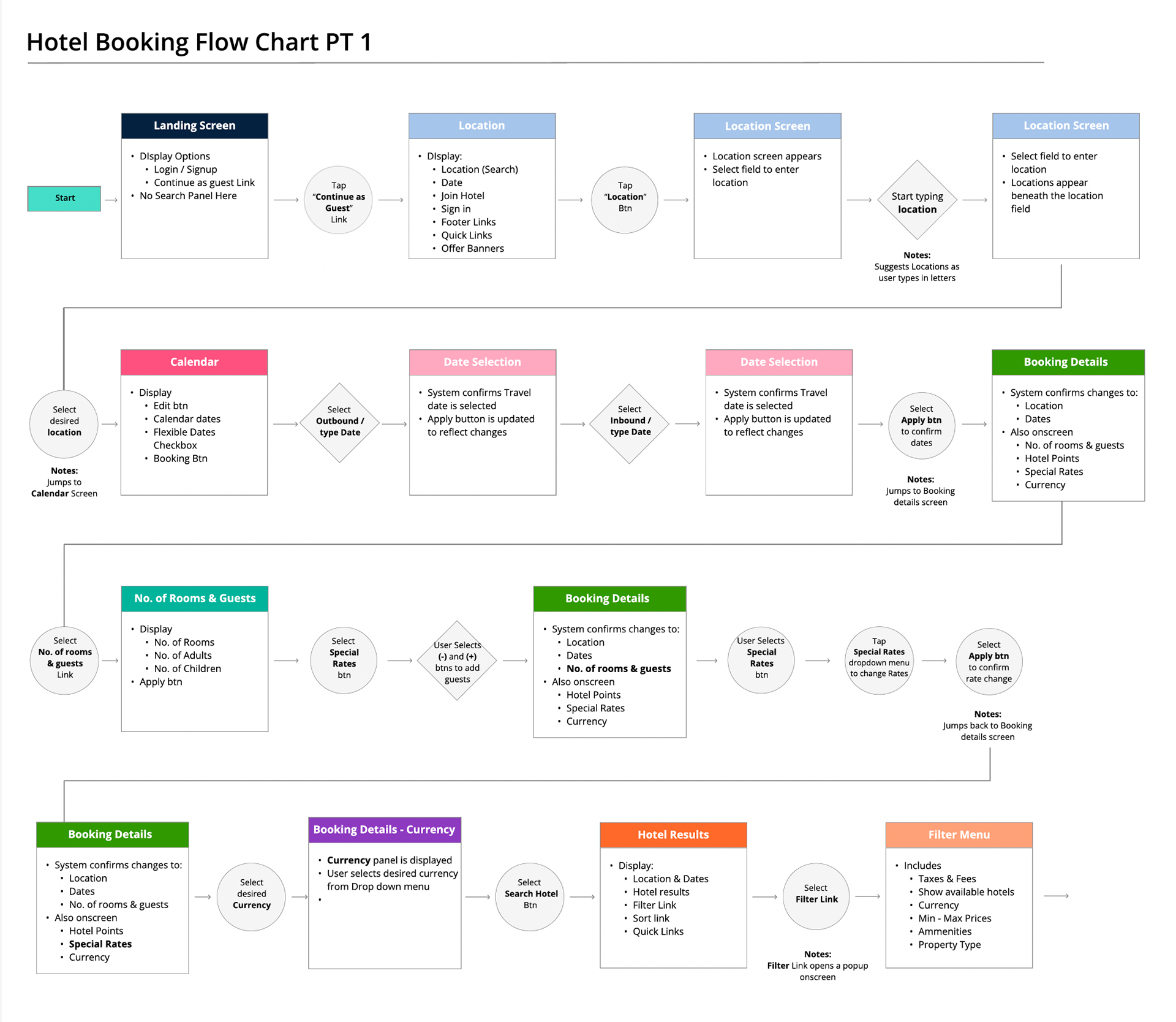
DESIGN
- FLOW DIAGRAM
- INTERACTION DESIGN SKETCHES
- MEDIUM FIDELITY PROTOTYPE
- WIREFRAMES
OVERVIEW
Onto the design stage of the mobile app. I've discovered what the issues are and now have to define a high-level booking flow for the app. This started at the homepage and ended at the Reservation screen.
DESIGN
- FLOW DIAGRAM
- INTERACTION DESIGN SKETCHES
- MEDIUM FIDELITY PROTOTYPE
- WIREFRAMES
OVERVIEW
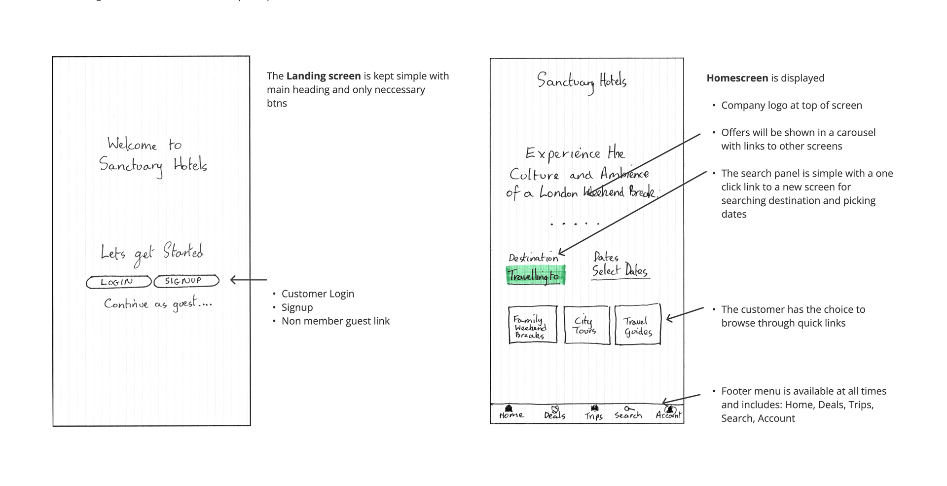
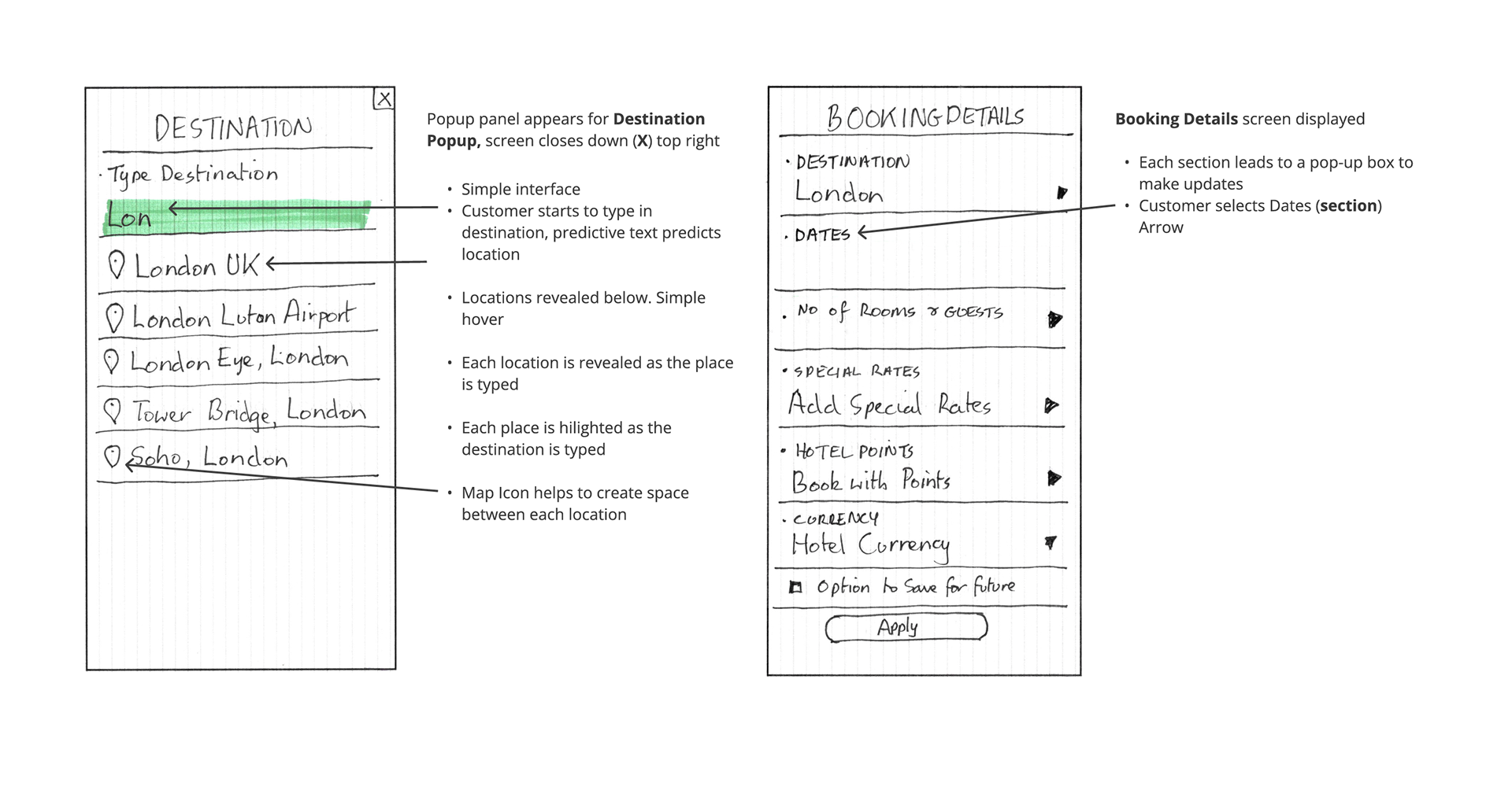
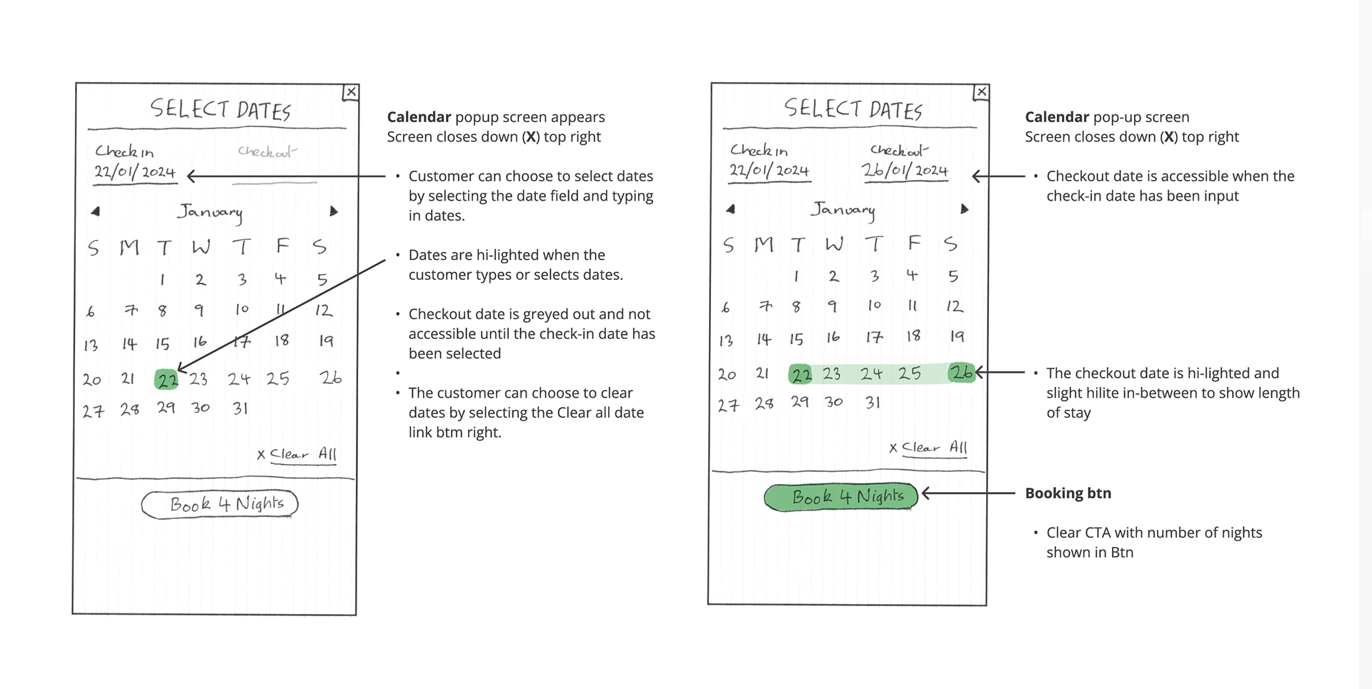
At this stage of the design task, I had to sketch screens for the hotel mobile booking process based on the flow diagram.
- Ensuring screen states were clear based on the users' actions
- Sketch until the flow is completed and note any inconsistencies or issues.
- Tackle any issues in the next iteration
DESIGN
- FLOW DIAGRAM
- INTERACTION DESIGN SKETCHES
- MEDIUM FIDELITY PROTOTYPE
- WIREFRAMES
OVERVIEW
From the sketch stage, the next part of the process involved creating a medium-fidelity prototype for the mobile app in Figma.
DESIGN
- FLOW DIAGRAM
- INTERACTION DESIGN SKETCHES
- MEDIUM FIDELITY PROTOTYPE
- WIREFRAMES
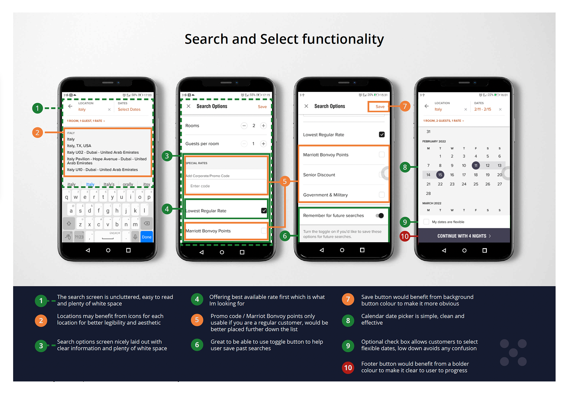
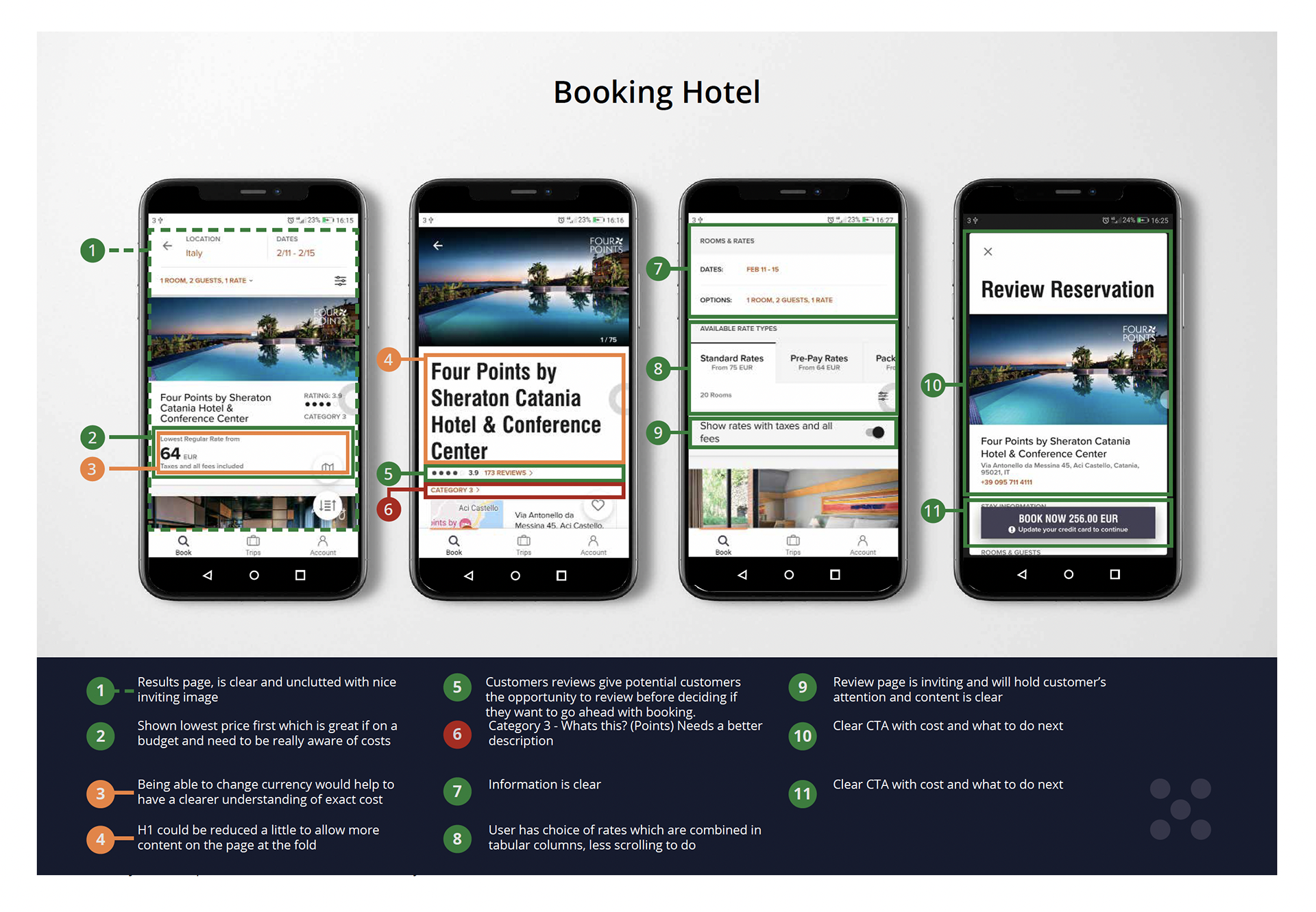
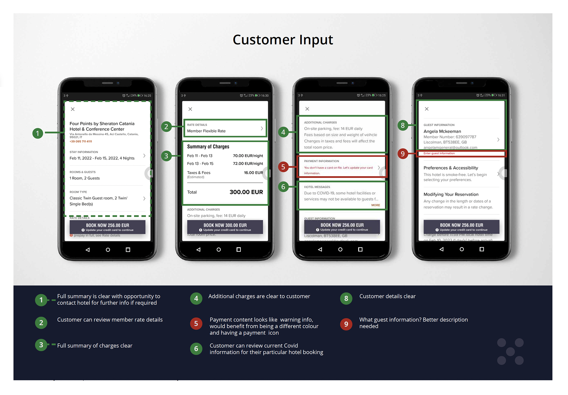
OVERVIEW
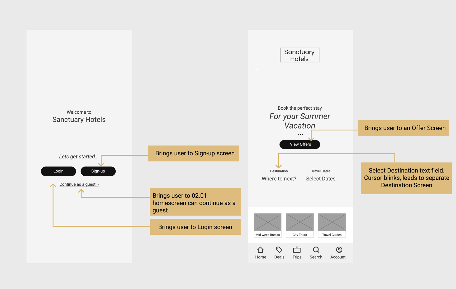
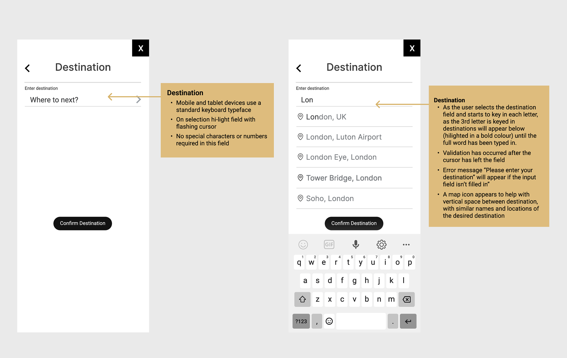
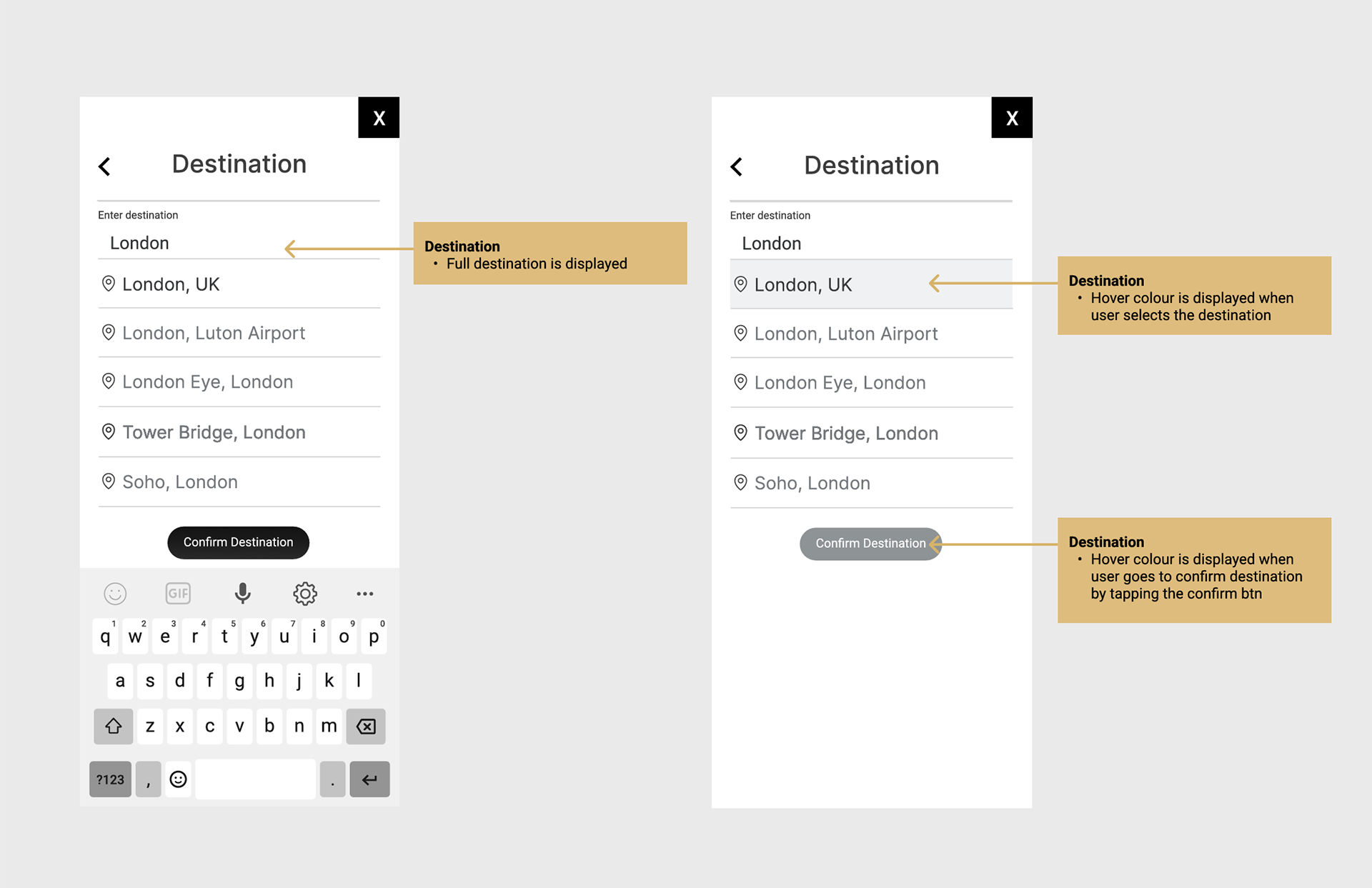
The last stage of the UX process was to create and annotate the wireframes for handover to UI designers and developer. Annotations had to be clearly explained.